import matplotlib.pyplot as plt
import numpy as np
# 设置全局样式(在绘图前调用)
plt.style.use('seaborn') # 使用seaborn风格
plt.rcParams['font.sans-serif'] = ['SimHei'] # 设置中文字体
plt.rcParams['axes.unicode_minus'] = False # 解决负号显示问题
# 创建示例数据
years = np.arange(2015, 2023)
gdp = [70.9, 74.6, 83.2, 91.9, 99.1, 101.4, 114.9, 121.0] # 单位:万亿元
# 绘制基础图表并美化
plt.figure(figsize=(10, 6), dpi=100) # 设置画布大小和分辨率
plt.plot(years, gdp,
color='#2b8cbe', # 使用HEX颜色代码
linewidth=2.5,
marker='o',
markersize=8,
markerfacecolor='white',
markeredgewidth=1.5)
# 添加标题和标签(美化版)
plt.title('2015-2022年中国GDP增长趋势',
fontsize=16,
pad=20)
plt.xlabel('年份', fontsize=12, labelpad=10)
plt.ylabel('GDP (万亿元)', fontsize=12, labelpad=10)
plt.grid(True, linestyle='--', alpha=0.6)
plt.xticks(fontsize=10)
plt.yticks(fontsize=10)
plt.tight_layout()
plt.show()
# 继续使用前面的GDP数据
plt.figure(figsize=(10, 6))
plt.plot(years, gdp, color='#2b8cbe', linewidth=2.5)
plt.annotate('新冠疫情爆发',
xy=(2020, 101.4),
xytext=(2018, 90),
arrowprops=dict(arrowstyle='->', color='#d62728'),
fontsize=10,
bbox=dict(boxstyle='round', facecolor='white', alpha=0.8))
plt.scatter(2020, 101.4, color='red', s=100, zorder=5)
plt.title('重大事件对GDP增长的影响', fontsize=16)
plt.xlabel('年份', fontsize=12)
plt.ylabel('GDP (万亿元)', fontsize=12)
plt.grid(True, linestyle='--', alpha=0.6)
plt.show()
# 多系列数据示例
literature = [8.2, 8.5, 9.1, 9.4, 9.8, 10.2, 10.5] # 文学类图书销量(百万册)
history = [5.1, 5.3, 6.0, 6.2, 6.5, 6.3, 6.8] # 历史类
years = np.arange(2016, 2023)
plt.figure(figsize=(10, 6))
line1, = plt.plot(years, literature, color='#e6550d', marker='s', label='文学类')
line2, = plt.plot(years, history, color='#756bb1', marker='^', label='历史类')
# 美化图例
plt.legend(handles=[line1, line2],
loc='upper left',
frameon=True, # 显示边框
shadow=True, # 添加阴影
framealpha=0.8, # 透明度
title='图书类别', # 图例标题
title_fontsize=12,
fontsize=10)
plt.title('2016-2022年图书销售趋势', fontsize=16)
plt.xlabel('年份', fontsize=12)
plt.ylabel('销量 (百万册)', fontsize=12)
plt.grid(True, linestyle=':', alpha=0.5) # 点线网格
plt.show()
# 调查数据
categories = ['经典文学', '历史传记', '社会科学', '科学技术', '艺术设计']
ratings = [4.2, 3.8, 3.5, 3.0, 3.7] # 平均评分(1-5分)
std_dev = [0.5, 0.6, 0.4, 0.7, 0.3] # 标准差
plt.figure(figsize=(10, 6))
bars = plt.bar(categories, ratings,
color=['#fdae6b', '#e6550d', '#756bb1', '#3182bd', '#74c476'],
yerr=std_dev, # 添加误差条
capsize=5) # 误差条端帽长度
# 添加数值标签
for bar in bars:
height = bar.get_height()
plt.text(bar.get_x() + bar.get_width()/2., height-0.1,
f'{height:.1f}',
ha='center', va='top',
color='white', fontsize=10, fontweight='bold')
# 美化图表
plt.title('大学生各类图书阅读评分', fontsize=16, pad=20)
plt.xlabel('图书类别', fontsize=12, labelpad=10)
plt.ylabel('平均评分 (1-5分)', fontsize=12, labelpad=10)
plt.ylim(0, 5) # 固定y轴范围
plt.grid(axis='y', linestyle='--', alpha=0.3)
# 添加数据来源说明
plt.text(0.5, -0.4, '数据来源:2023年大学生阅读调查,样本量n=1200',
ha='center', va='center',
transform=plt.gca().transAxes, # 使用相对坐标
fontsize=9, color='gray')
plt.tight_layout()
plt.show()
案例:区域文化发展多维度分析
# 准备数据
regions = ['东部', '中部', '西部']
culture_funds = [12.5, 8.3, 6.7] # 文化事业费投入(亿元)
museums = [356, 278, 192] # 博物馆数量
art_troupes = [1245, 876, 532] # 艺术表演团体
# 创建子图
fig, (ax1, ax2, ax3) = plt.subplots(1, 3, figsize=(18, 6))
# 图表1:文化投入
ax1.bar(regions, culture_funds, color='#6baed6')
ax1.set_title('各地区文化事业费投入', fontsize=14)
ax1.set_ylabel('投入金额 (亿元)', fontsize=12)
# 图表2:博物馆数量
ax2.scatter(regions, museums, color='#fd8d3c', s=200) # s控制点大小
ax2.set_title('博物馆数量分布', fontsize=14)
ax2.set_ylabel('数量', fontsize=12)
# 图表3:艺术团体
ax3.plot(regions, art_troupes, color='#74c476', marker='o')
ax3.set_title('艺术表演团体数量', fontsize=14)
ax3.set_ylabel('数量', fontsize=12)
# 添加整体标题
fig.suptitle('2022年区域文化发展指标对比', fontsize=16, y=1.05) # y调整垂直位置
# 统一美化
for ax in [ax1, ax2, ax3]:
ax.grid(True, linestyle=':', alpha=0.3)
ax.tick_params(labelsize=10)
plt.tight_layout()
plt.show()
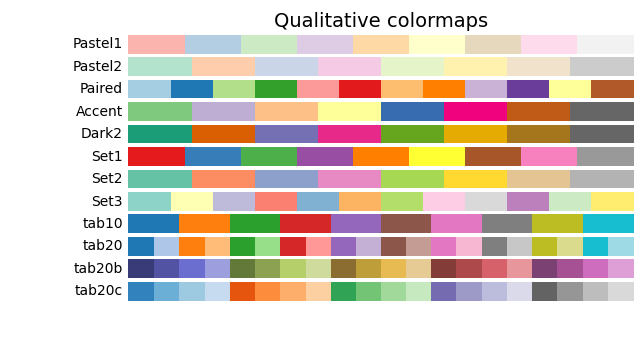
| 名称 | 适用场景 | 示例颜色 |
|---|---|---|
Set2 |
6-8个分类 | 适用于少量分类数据的对比展示 |
Paired |
成对对比数据 | 适合AB测试等对比实验数据 |
Accent |
突出显示关键分类 | 用于强调重要分类 |
| 名称 | 适用场景 | 色系示例 |
|---|---|---|
Blues |
正数数据/渐进式变化 | 浅蓝到深蓝渐变 |
Oranges |
需要暖色强调的数据 | 浅橙到深橙渐变 |
Greens |
环保/增长类数据 | 浅绿到深绿渐变 |
| 名称 | 适用场景 | 色系特点 |
|---|---|---|
RdBu |
红-蓝对比(政治/温度) | 红色表正,蓝色表负 |
PiYG |
粉-绿对比(生物/医疗) | 粉色表正,绿色表负 |
BrBG |
棕-绿对比(地理/环境) | 棕色表正,绿色表负 |
# 定性调色板使用示例
colors = plt.cm.Set2(np.linspace(0, 1, 5)) # 生成5个Set2色系的颜色
# 顺序调色板使用示例
plt.imshow(data, cmap='Blues')
# 发散调色板使用示例
plt.contourf(x, y, z, cmap='RdBu', levels=20)
````markdown
# 推荐中文排版设置
plt.rcParams.update({
'font.family': 'SimHei', # 中文显示
'font.size': 12, # 基础字号
'axes.titlesize': 14, # 标题字号
'axes.labelsize': 12, # 坐标轴标签
'xtick.labelsize': 10, # X轴刻度
'ytick.labelsize': 10, # Y轴刻度
'legend.fontsize': 10 # 图例文字
})
特点:
plt.style.use('样式名')调用 适用场景:
核心功能:
推荐用途: